Showing posts with label post processing. Show all posts

April 19, 2015


I have never been a fan of adding grain to my imagery. I think my obsession with having optimal image quality steered me away from the idea. Recently however, my sister sent me an old photo of our family and seeing it inspired me to experiment with grain in Lightroom. The less than good image quality stemmed from the photo being taken with a disposable film camera at night using the flash which illuminated the people in the photo but not the dark space around us which ended up grainy.  


I did not want to sound like an oaf on this subject and while researching the properties of film grain I found this article (a tough but fun read) which states:
The term “film grain” is often incorrectly used to describe the “fundamental” particles in a chemical-based photographic image. Fundamental image particles are the smallest particles that form an image: (a) silver particles or (b) color dye clouds ... 
Film grain is a repeating noise pattern that is an order of magnitude larger than the fundamental image particles. Film resolution is directly related to the size and distribution of silver particles in an emulsion. The noise pattern tends to obscure detail rather than define detail. The pattern is superimposed over the image, not the source of the image.
A common mistake [made by the author many, many times], is to think that film grain is the image-forming element. Many Kodak and Fuji publications, including much of the popular photographic literature (magazines), commonly make the mistake of referring to fundamental film particles as film grain. This further propagates the imprecise usage of the term.
Although this information may seem archaic, the scientist in me found it to be very interesting because it helped me understand how I should better approach adding digital grain to an image. 


I think the most important thing is that adding grain should be the very last thing you apply to a fully processed image. It helps to think of your edited RAW (or JPEG) file as the "fundamental image particles" (in the digital world it is actually the pixels making up the image) and the grain as a noise artefact being superimposed on top of it. The end result is that you obtain a digital image that has more of a film like rendering to it.


In Lightroom you are able to add grain in the "Effects" module and the adjustment sliders consist of  "Amount", "Size", and "Rougness". When adding grain into the mix, I usually toggle between the "1:1" and "FIT" to look at the changes on a magnified and overall level. This ensures image quality does not deteriorate to the point where you lose fine detail. Size and roughness play a major role in this and amount impacts the overall effects of both. As with all my processing, I just adjust the sliders around until the end result is something I am looking for. In the week of playing around with this process I like Amount:50, Size:20, Roughness:20 for moderate grain and Amount:50, Size:20 Roughness:50 for a more distinct look. Some other things to note are that:

  • Grain is more noticeable in the darker areas of a photo, especially the mid-tones (or "clipped"/"faded" blacks).
  • Grain is also more evident in out of focus areas.
  • Increasing the grain deteriorates image quality especially in subjects with fine detail such as hair or eyelashes.
  • It helps to look at film images to help understand what looks natural.
  • When noise reduction is not set to 0, the effect of adding grain is diminished. 
  • If the image was shot at a high ISO, you probably do not need to add additional grain.

Image Samples


Again, I have only been experimenting with this for a short period of time so the information I presented here should be taken with a grain of salt. Some may think it is silly to strive for a good digital camera with a nice sharp lens only to ruin the output with the addition of grain, but I have definitely had fun playing around with it. I am sure film photographers out there would say "just shoot film". For digital photographers who haven't used the medium however, working grain into your aesthetic can a step in the right direction. Anyone else out there add grain in their post processing workflow?? I'd love to hear your thoughts/tips in the comments section =) Sam

If you live in, or are traveling to Florida and would like to schedule a photo-shoot, I am currently offering portrait services in and around Central Fl. Check out more of my work at www.samgoldphotography.com

March 22, 2015

Wildflowers

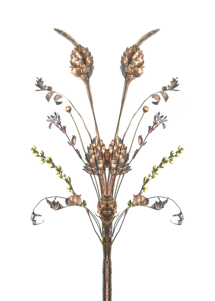
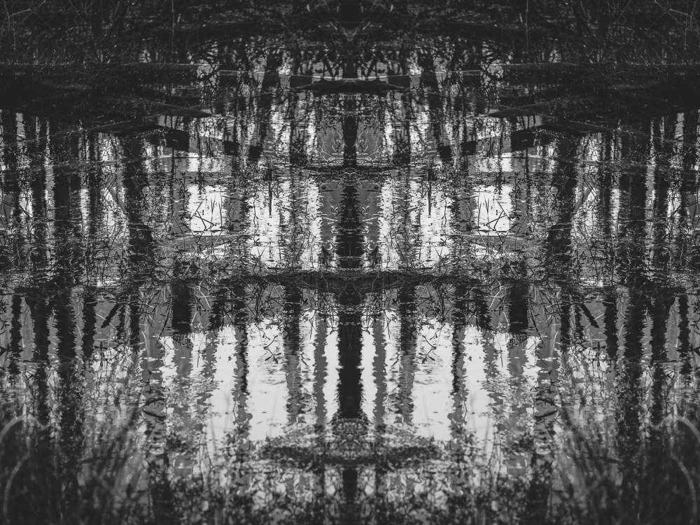
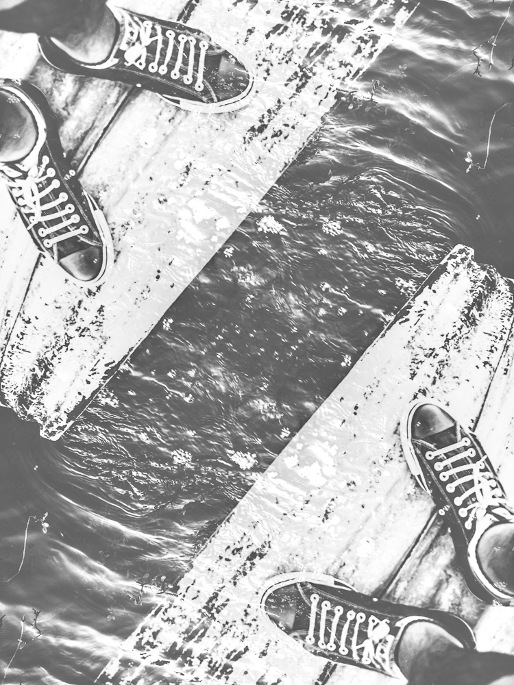
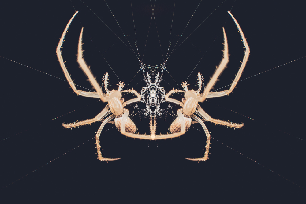
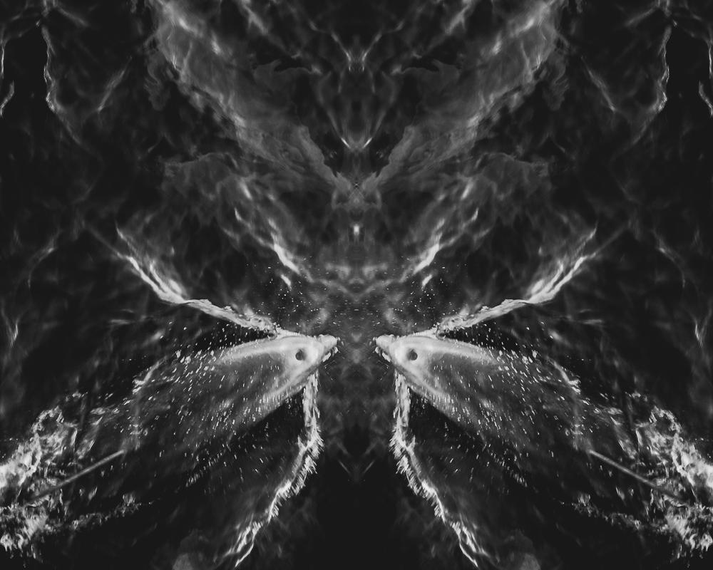
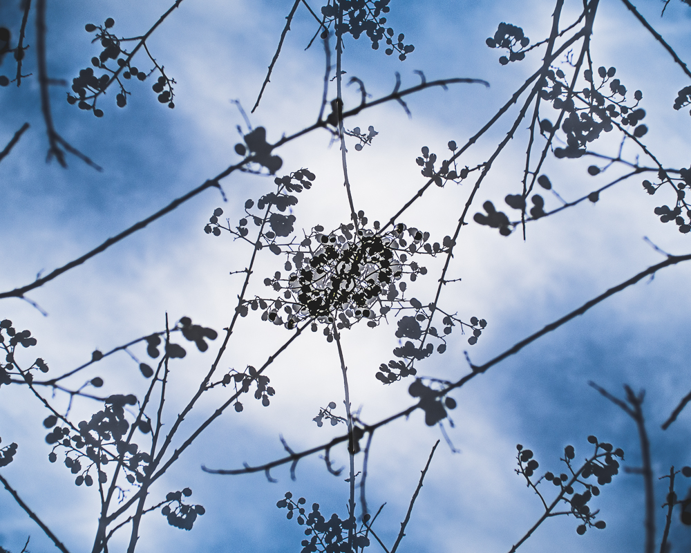
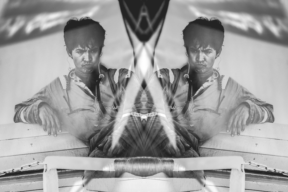
A while back I submitted a collection of photographs to GRAMR in hopes of joining their team of photographers. They got back to me and let me know that they were interested in floral themed photography for spring. This is in no way my genre but my first idea was to do something that involved wildflowers because I think their beauty is often overlooked. I collected some samples and brought them back to my home and photographed a group of them under studio conditions. While in the post processing phase I thought it would be neat to process the shot as a symmetrical double exposure. The resultant photo is above and while it was too experimental for the card company, I am happy that I discovered this technique. All that is required is the Enfuse plugin (originally reviewed for HDR here and multiple exposures here) and I thought it would be fun to show what I did in Lightroom to make this image:

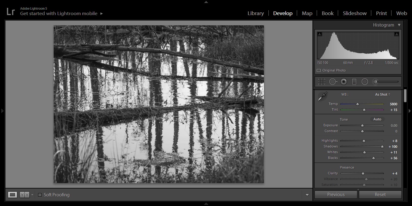
1. Make global and local adjustments:

Adjust anything that your RAW image processing workflow normally consists of. For me, this includes adjusting the white balancing, choosing an aspect ratio, adjusting items under Lightroom's "Basic" module (shown), tinkering with the tone curve, and a good balance between sharpening and noise reduction. Also conversion to black and white with adjustments to the color channels if necessary. 

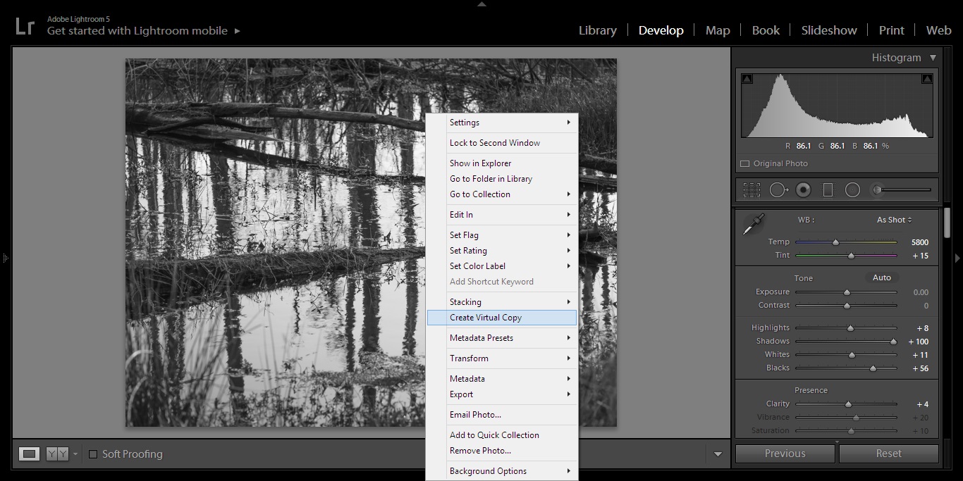
2. Create a virtual copy:

Right clicking on the photo will bring up a menu which allows you to make a copy of the image that has the same global and local adjustments made to the original version.

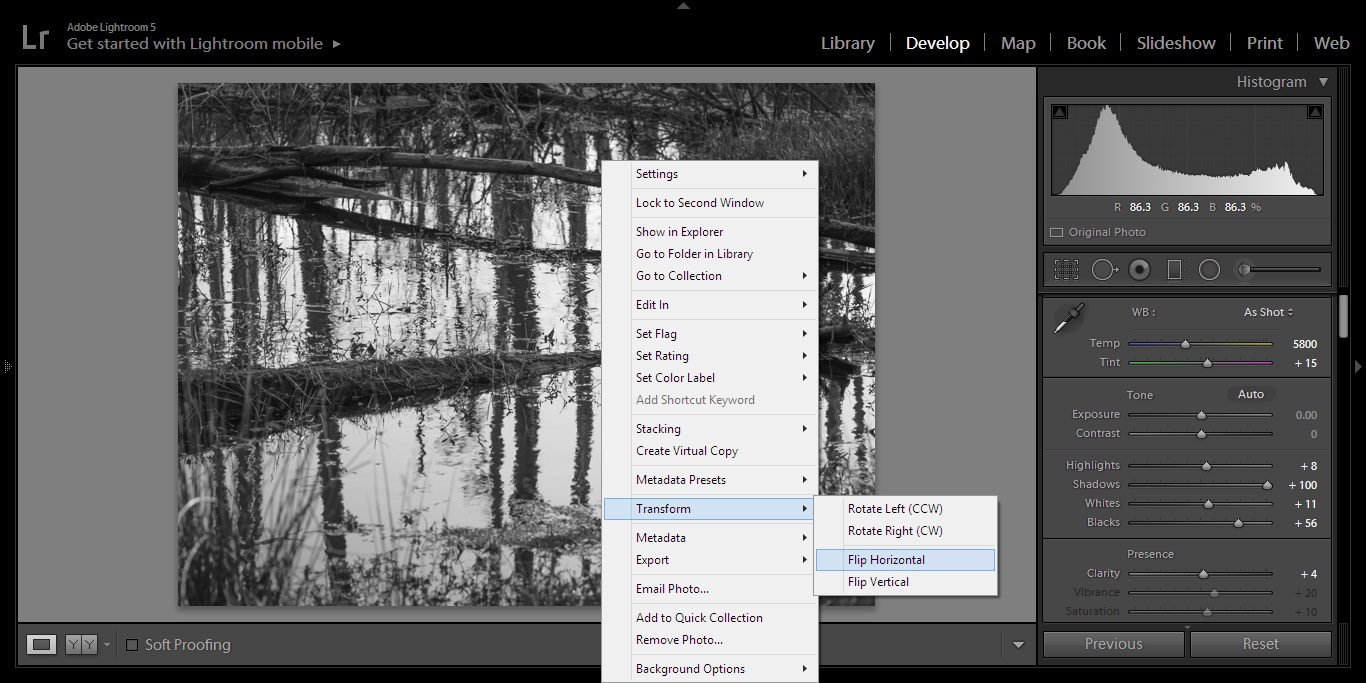
3. Transform the copy:

Under the "Transform" heading of the same drop down menu you have the option to flip the image horizontally or vertically. I chose horizontal for this image because I want it to have left to right symmetry. *** You can also flip horizontally and then again vertically if you want a reflected symmetrical image. 

4. Enfuse:

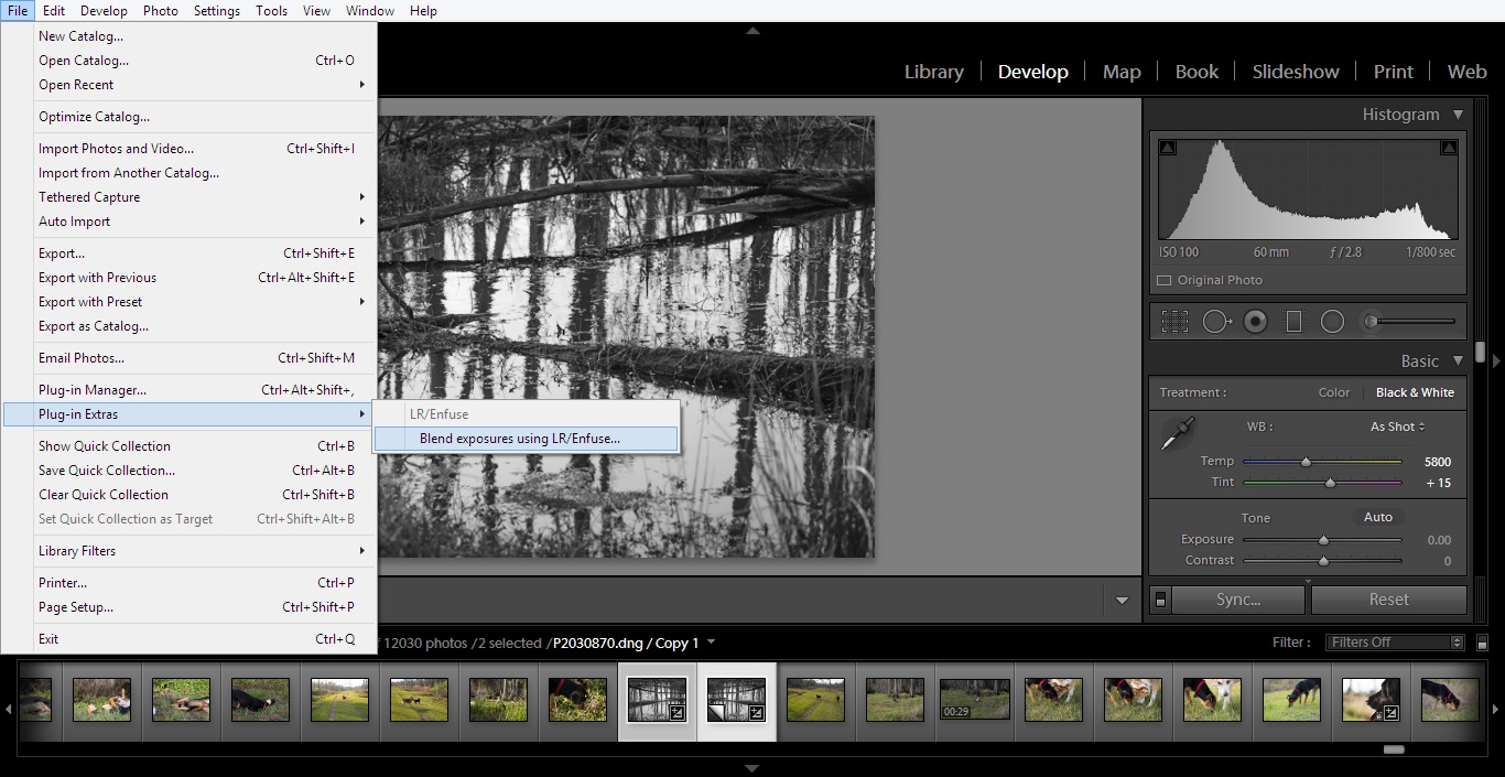
The initial review that introduced me to this plugin and link to download Enfuse can be found here. It seamlessly integrates into Lightroom and can be found under "Plugin Extras" in the "File" directory.  

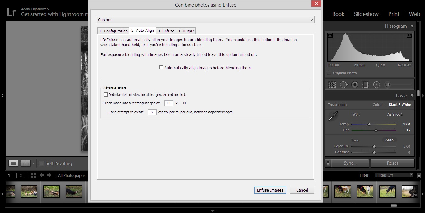
This is probably the most important step, make sure the "Automatically align images before blending them" box is unchecked. If it is checked, you will likely get an error message after about 5 minutes of Lightroom having a melt down because the images don't line up. 

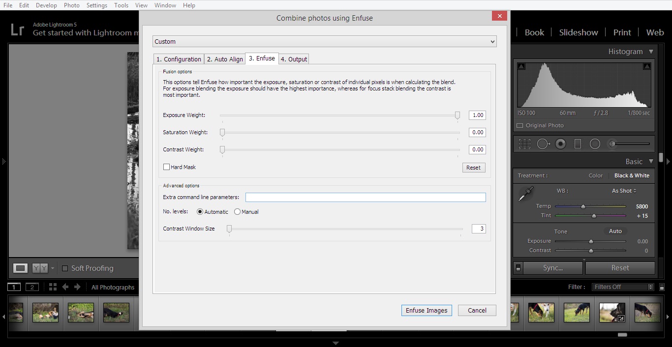
Under the "Enfuse" tab I usually set the Exposure Weight slider to 1.00 like I do during my normal double exposure workflow. After this, choose your output options and hit the "Enfuse Images" button.

5. Edit the resultant photo to taste:

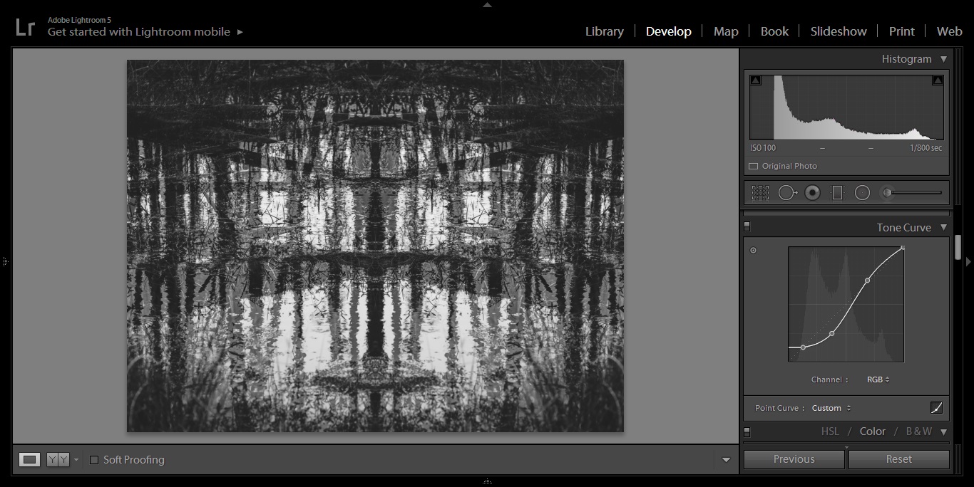
In my experience, the double exposures processed through Enfuse have come out "flatter" than their original counterparts. To fix this I usually adjust the tone curve of the image or make additional global adjustments in the "Basic" module in Lightroom. Color images usually require more work and sometimes I will do a black and white conversion during this step if I cant make it work in color.

Vualá

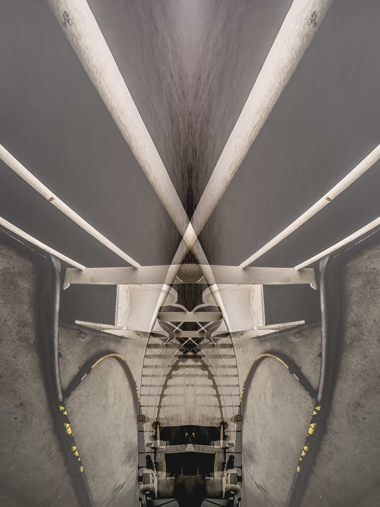
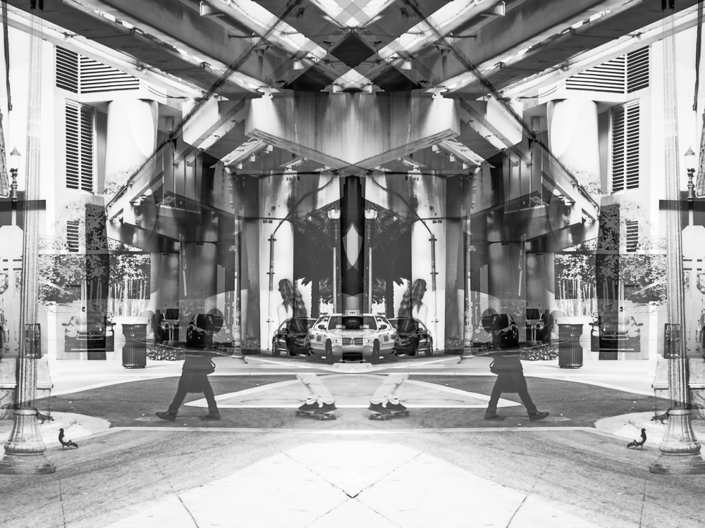
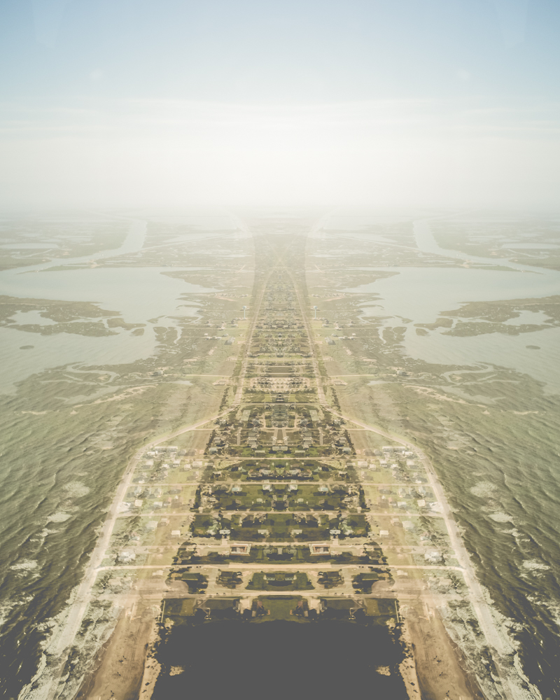
This type of abstract photography is probably not for everyone, but I like the idea of producing something unique out of a seemingly normal photograph. When culling through my Lightroom catalog to produce extra image samples I focused on finding ones that had obvious leading lines. Also, detailed subjects that are directly in the middle of the frame have the tendency to become lost so images composed with the rule of thirds in mind are better suited for this. I would love to hear what you think of this experiment in the comments section =) -Sam

If you live in, or are traveling to Florida and would like to schedule a photo-shoot, I am currently offering portrait services in and around Central Fl. Check out more of my work at www.samgoldphotography.com

Extra Image Samples
Twins

Charlotte's Web
Little Green Man
DNA
Skater Boy

Infinity
*** I transformed this image horizontally and vertically before "Enfusing" 
Conjoined

When Sea Level Rises

December 05, 2014


Before joining the vessel I am on, I left my phone charger in a hotel room while in transit to the job (I was exhausted from staying up all night trying to get this photo). I felt like kicking myself mainly because I use the VSCOcam app (hereafter, VSCO) heavily on my android phone and almost always edit there before posting to Instagram (@samgoldphotos). I also have the app on my iPad mini but I had only used it a few times before abandoning it completely because the android version was a great deal better. Since I was unable to charge my phone on a regular basis, I grudgingly began to use VSCO on the iPad for photo editing and slowly became accustomed to it. Beggars can't be choosers right?!! 


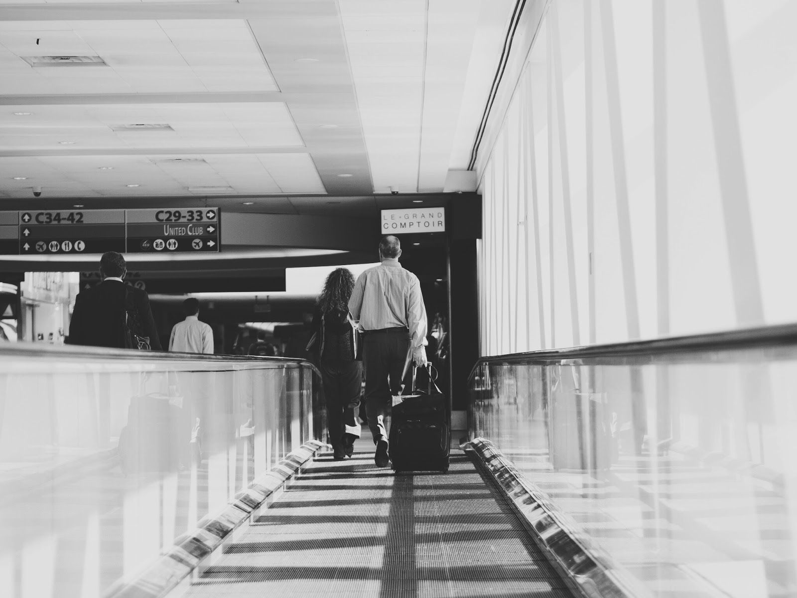
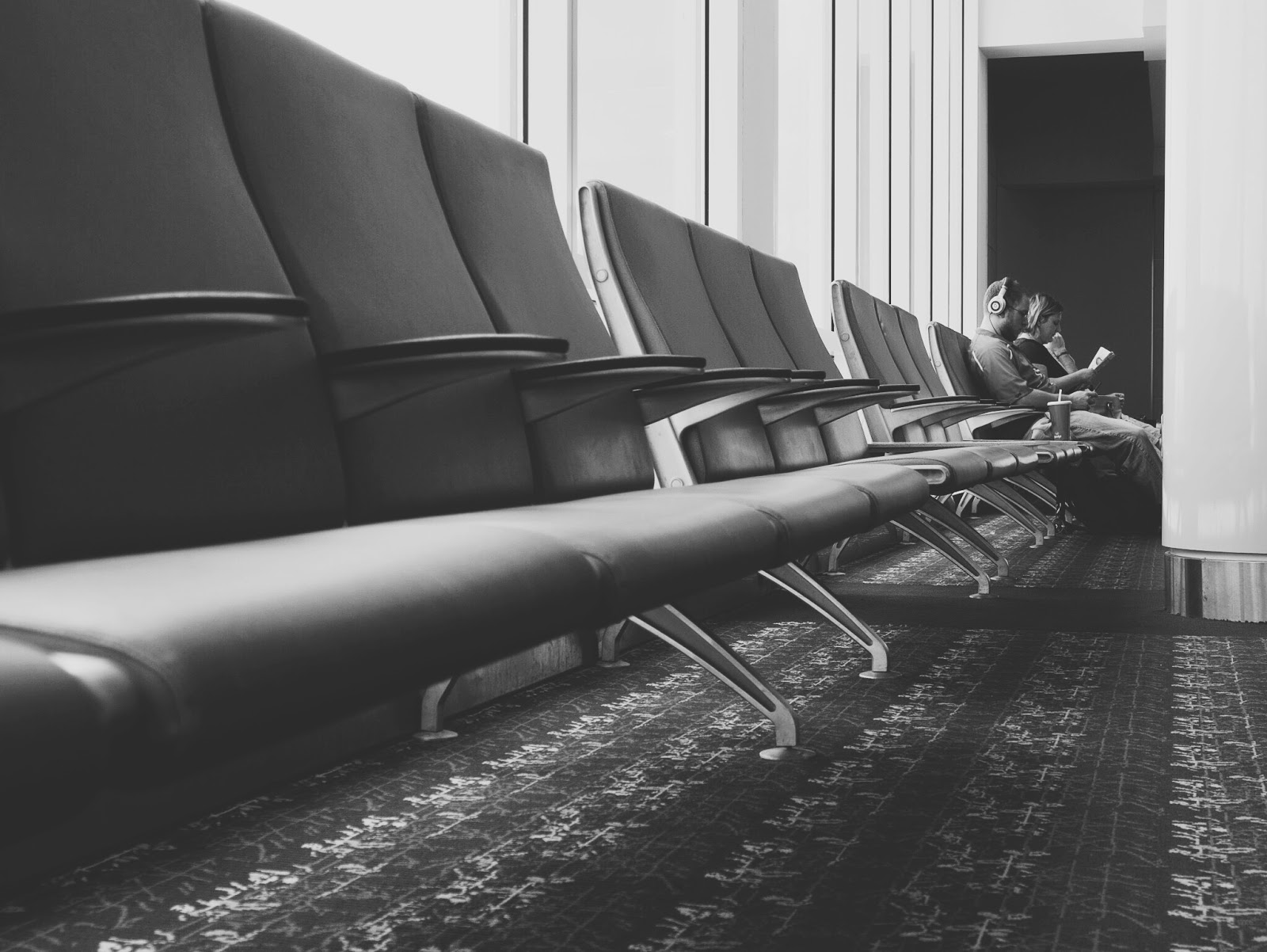
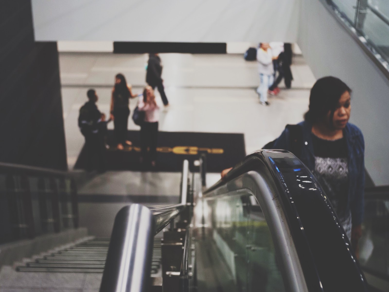
I heard about the an update to iPad's VSCO app through The Phoblographer and decided to try and download it while offshore. Because of the horrible internet out here, it took about three days, but it was worth the wait. The Phoblographer has provided a very nice article and I do not want to beat a dead horse so here I just wanted to highlight some of the newly added features and give my opinion on some things that would make this app truly amazing. All photos in this entry were taken in various airports which I find are one of the most interesting places to practice street photography.

VSCO 4.0

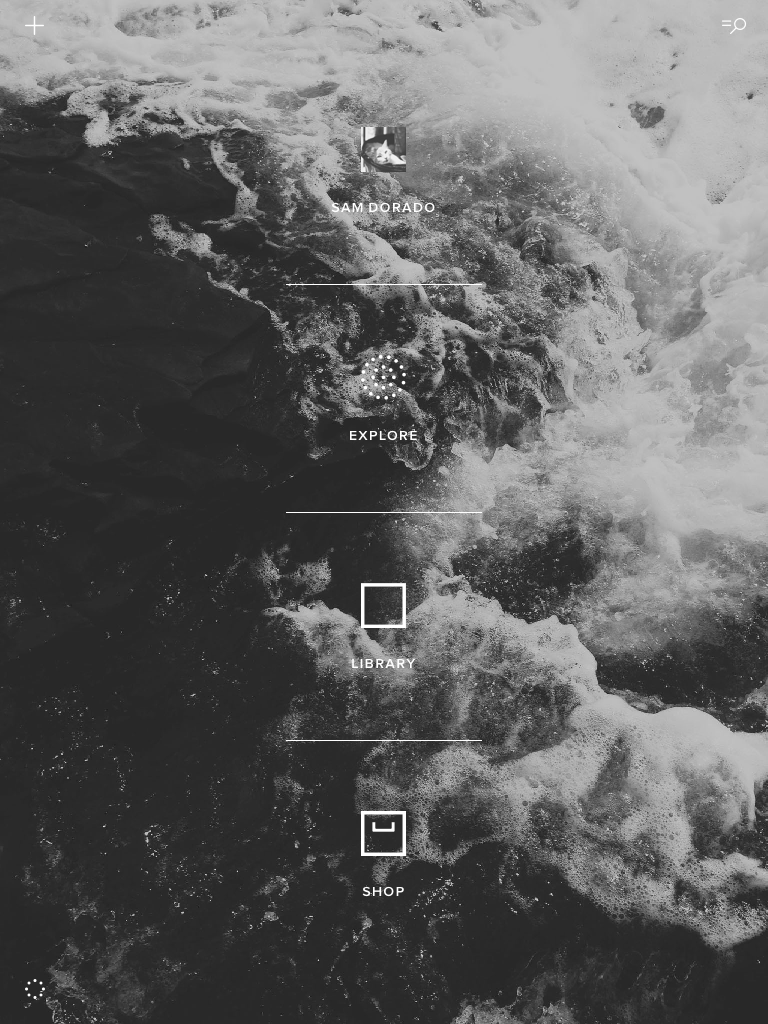
Like Julius Motal mentioned, when you open VSCO for the first time you will be brought to this screen:


At first I was bummed because I could not figure out how to change the background photo. Being stuck with viewing the same abstract triangular building image for the rest of my days scared me. But then... it changed!!! Awesome, now I am actually excited and looking forward to what they present each week (or whatever the interval may be). One thing that The Phoblographer did not mention was that if you tap on the circle dot icon at the bottom left hand corner of the page a preferences menu appears. This will let you change a host of things, but (in my opinion) most importantly the order of presets!!! I must admit having presets A4-6 removed from A1-3 just because they were purchased at a different time drove me crazy! I am so very grateful for the person at the VSCO headquarters with a slight case of OCD. You can either hold the cross (+) at the end of the preset box and move it up and down OR just hit A-Z and bring a little order to your life.

  
This applies for the toolkit as well. Genius.


Once you import your images into your library, there are several options for viewing by tapping on the gridded square at the top of the interface. 
In the old version of the app, this was your only option:


Now you have three options to choose from and the best thing is that the images are seen in their native aspect ratios (I have never been a fan of the square format):


 On top of all this, you can customize what you see which makes life easier if you are working on editing a series of photos at one time:


After choosing an image from your library to edit you have the option to apply a preset (paintbrush icon) or make global edits (wrench icon). I usually work by applying the preset and then tweaking the output but if you make any global edits first and then apply a preset they will be applied on top. One nice feature is that you can now see how your image will look with multiple presets applied at the same time. You just hit the gridded square icon at the bottom left of the interface after pressing the paintbrush icon.


Another great improvement is that you can see exactly what has been applied to an image by hitting the "history" icon:


This is very nice, but I miss having the option to "go back one step" which the older version had. Here the only option is to revert the image back to its original state (bottom right corner) and if you press and hold the image it will show the original as well - like in Snapseed. Some other changes to the iPad app are the ability to sharpen and add a vignette both of which were not a tool in the previous version.


Additional features I have not used so will refrain from commenting on include: syncing between devices, the newly implemented VSCO journal, and improvements to using the camera. The last thing that I am excited about but have not yet experimented with is the ability to upload your images using your browser and have them show up on your device. This makes perfect sense for those using something other than their phone as their primary camera. I usually shoot raw with my EM5, make slight adjustments in Lightroom (mainly sharpening with a mask), export, and then transfer the JPEGs to my iPad. Now at least the last step will be avoided!


Extra Image Samples   


Conclusions


I have always been a fan of the VSCO platform and the updates to this app for iPad definitely make it a more pleasurable experience. I think it is now even better than the android version on my phone however there are some things that would make this app exceptional. For starters, and my major gripe is that I cannot access my G+ library!!! In order to get to those photos I have to download them to the camera roll first which is inconvenient and unnecessary. I think this is an iPad issue however as I can access the G+ library with all of the apps on my phone, but none of the same apps on the iPad. I suppose the work around is to import them on my phone first and then wait for the devices to sync but it would just be great import directly. Also, I do not think that you can directly transfer an image from VSCO to edit in another app. The image needs to be saved to the camera roll first and the end result is a bunch of versions of the same photo. Another item on my wishlist is the 16:9 aspect ratio as a crop option but as a film photography emulator I understand why this cinematic option is not included. Finally, it would be nice to be able to add a border directly in the app but again, as a marketed film emulator I understand that VSCO is not "that kind of app". Regardless, if you have an iPad, head over over to the app store and give VSCO a shot! I have pretty much purchased/downloaded all the presets available and besides the free ones (which are awesome- especially Hypebeast) I recommend the "Legacy" and "Limited Edition" collections. Most of the photos in this blog were processed using the 02, A5, B2, C2, HB2, LV2, N1, and SE3 presets which have become my favorites. 

Sam D.
 
© 2012. Design by Main-Blogger - Blogger Template and Blogging Stuff